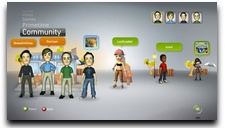
We’ve had some time to look through the New Xbox Experience (aka Fall Update 08) for the Xbox 360. There are some goods, bads and oddities about the latest updated firmware and thought it was a good time to share.
 The most important feature we’ve found with the new console software is the addition of Netflix. The ability to play software in the “Instant Queue” is excellent, fast and done with high quality. If you have children this may be one of the must-have product features; add a ton of family movies to the Netflix Instant Queue and your children will have hours of entertainment.
We’re not telling you to sit the children in front of the TV for ten hours, but it proves to be a great way to get quality entertainment without bombarding them with commercials telling them to tell you they need new stuff. This is especially true around the holidays where kids are watching more commercials than actual episodes of Sponge Bob Square Pants.
We were a non-Netflix household and recently bought into their second tier program so we can watch instant shows and get one DVD at a time. The NXE has up-sold at least one new Netflix customer, great job Microsoft!
Avatars are another “feature” to the new console software and it all seems very Wii like. Months ago we were kidding about how they’re cloning some features of the Wii but in reality, it’s more a clone than we thought. The sound track while creating your Avatar feels almost ripped from the Wii in terms of cute settling sounds and silly uplifting music. This isn’t your dad’s console anymore Timmy.
The outfits to dress your Mii, oops, avatar in are very limited and you’ll no doubt see a lot of sameness in dress and overall look to the avatars. But, now Microsoft is showing us how to differentiate ourselves by purchasing virtual items to make our avatars cooler. For 250 Microsoft points you can now buy a Ninja Blade theme pack which includes wallpapers and avatar items. Yay. No, seriously, we’re supposed to buy this crap?
The NXE also supports a full system re-design, out with the blades in with the… Cover Flow? The NXE now acts more like iTunes, the iPod and the Apple OS X more than ever. You’ll breeze through your game list, NetFlix Queue, Friends List and other features as if it were Cover Flow album art. Cool in some ways, frustrating in others.
In some ways, item lists are the fastest and easiest ways to view things. For instance, prior to NXE you could tell who was online in your friends list within a few seconds. Now, with NXE you’ll troll through your friends list four-by-four flying through the “art” of your friends avatars hanging out next to a “room” mimicking the game they’re playing. Cute, no doubt, but not an effective way to see who is online.
The in-game console pop-up windows are much cleaner and easier to browse using a mini-blade style approach to finding information. This new re-design allows you to get more from your console interface while in-game than ever before.
The one neglected feature, in my humble opinion, is the “spit and polish” of the new interface. They took some aspects of OS X and some aspects of Wii and mixed them together to make organizational changes, some good and some bad. However, the interface is very flat, drab and boring. There is no real glossy shine to anything, very little in textures for backdrops and windows fixtures and very anti-vista like when it comes down to drop shadows and beauty. A little more glamor, gloss and reflective surfaces would have made the interface look a bit more next-generation in terms of cool factor.
Overall, it is what it is. You may like it, hate it or just learn to live with it. Some features will be easier to browse around while others will require a bit more work. We’ve noticed about a 10 to 12 second pause between shopping screens for add-ons, arcade game downloads and such, hopefully that will change in the coming weeks. It stands out as a bit different from the competitors, in some aspects, while paying tribute to some of the cooler features of other products.
The Netflix addition is the best part of NXE, but that could have come available without a full user interface redesign. Your thoughts?


The Netflix service is f’ing awesome. I prefer the miniblade navigation to the main X/Y nav they have, but I can see where it’ll appear to more casual users.
Installing games is also cool.